Daniel Shui
CLOSEINFO
Multidisciplinary designer developing digital and print projects for individuals, businesses, and organizations across various sectors. His practice encompasses UI/UX, typography, brand development, creative direction, editorials, & more. He has worked on projects for clients both big and small, including the Chicago Bulls, Crypto.com Arena, Texas Rangers, Olympics, FIFA, FC Barcelona, & many more.

Currently based in the city of Toronto, and is always interested in collaborations with others around the world. Please get in touch for any inquiries or to see additional work.
Special thanks to Ameer Ahmad, for programming this website. Designed by Daniel Shui. Last updated on 05/07/25.
WorkPlay
Loading
Daniel Shui
Index
01
Texas Rangers Renewals 2026, websites
02
Analog to Digital, thesis book
03
Pluriversal Typography in Local and Global Contexts, Exhibition Poster
04
Exran, WIP sans serif typeface
05
40th Science Olympiad at Michigan State University, event poster
Texas Rangers Renewals 2026, websitesEntering the 2026 MLB season, the Texas Rangers wanted a new look that stood out as much as their big offseason changes. This campaign spanned across a series of websites, including season ticket renewals, suites, new sales, and 20-game package plans.

I led the design direction from end-to-end, including the web experience, interfaces, navigation, and creation of new assets. My designs for these websites drew from their latest branding campaign, “Neon Roadhouse”.
July 2025Website Series
01/06
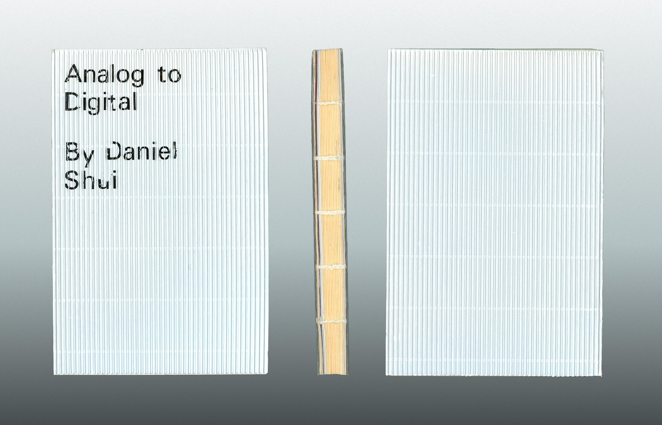
Analog to Digital, thesis bookAnalog to Digital is the culmination of work produced for my graphic design bachelor’s thesis. It compiles a year’s worth of essays, research, experiments, and final work, which seeks to reintroduce physical experimentation into today’s overwhelmingly software-driven design processes. My projects specifically focus on my interest in typography, with each emphasizing materiality, unexpected play, and form. This was done to create letterforms that weren’t just meant to be read but also experienced and seen.

Each copy was hand-bound and includes a manually typeset corrugated cover, a nod back to the contents in the book. The majority of the book was printed through RISO, with different papers and inks used to distinguish the stages within it.
May 202414 x 21 cm
268 pages
01/04
Analog to Digital, <span class='lowercase not-italic'>thesis book</span>
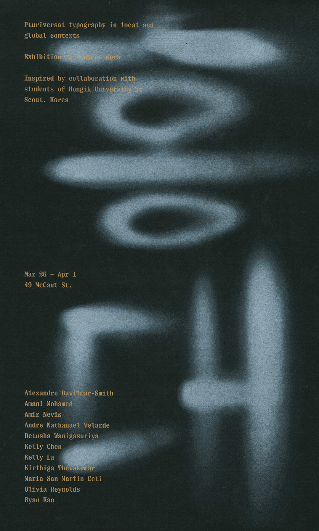
Pluriversal Typography in Local and Global Contexts, Exhibition PosterIn this international cultural exchange, students from OCAD and Hongik University collaborated in Seoul in honour of the sixtieth anniversary of diplomatic relations between South Korea and Canada. The exhibition shows the final works of a week-long intensive workshop, site-visits related to Korean culture, and the celebration of Hangul Day.

Taking advantage of the angular construction found throughout the Korean Hangul alphabet, the letterform graphic is created through light beams. Using spotlights, I cast light on surfaces from different angles to create organic letterforms reminiscent of traditional Korean calligraphy (서예), representing the cultural focus of the exhibition. The poster is printed on black paper using multiple layers of white RISO ink.
January 202420 x 44 cmExhibited as part of Swash & Serif 8
01/02
Pluriversal Typography in Local and Global Contexts, <span class='lowercase not-italic'>Exhibition Poster</span>
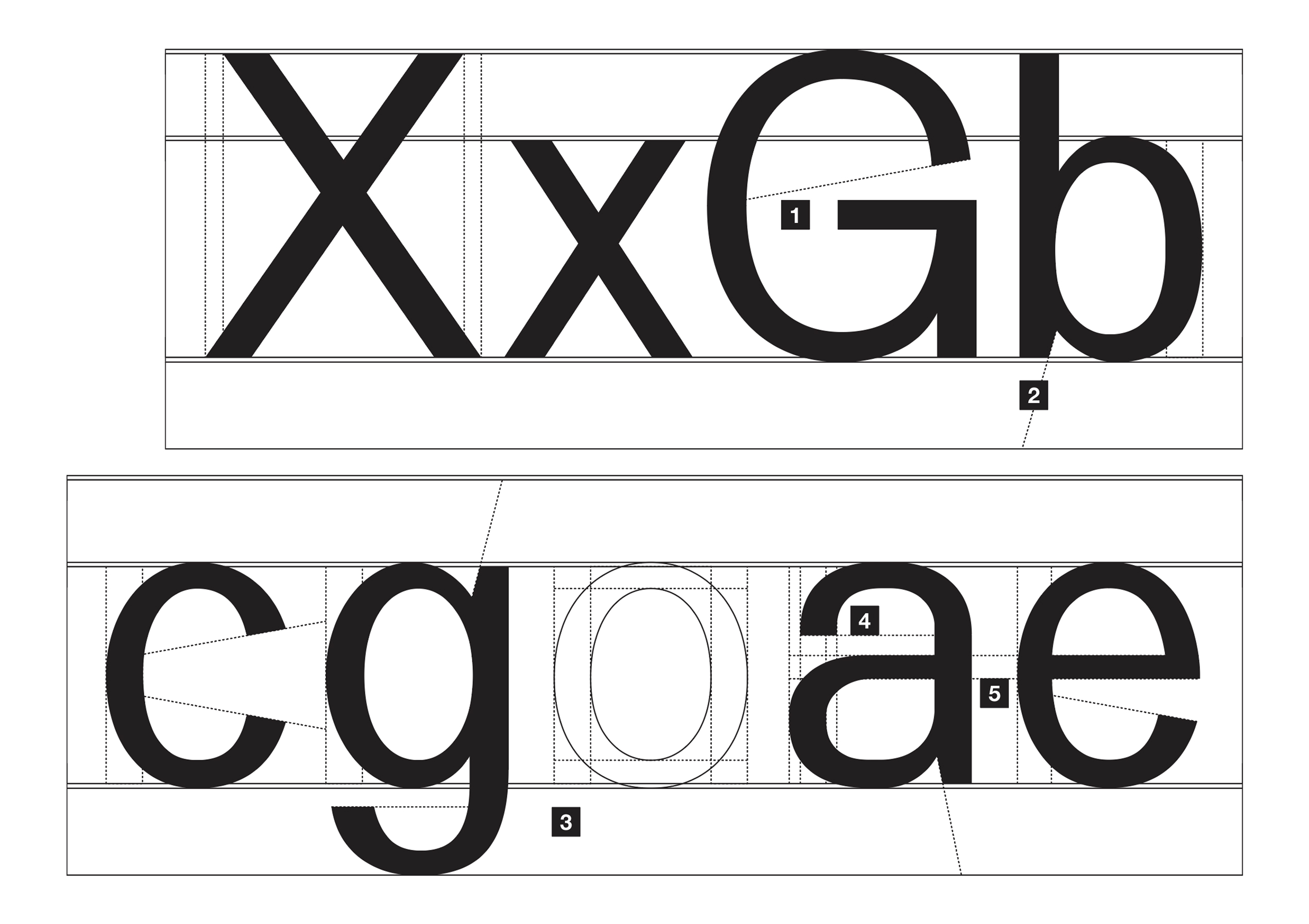
Exran, WIP sans serif typefaceExran is a contemporary neo-grotesque sans-serif typeface built for versatility. It is unique, featuring contrasting stroke widths, distinctive terminals, and lowered ascenders/descenders throughout its letterforms. This typeface seeks to excel whether on screen or print, body copy or header.

  1. Curved terminals always end at a 20° angle with the exception of the lowercase “a”.
  2. Specific lowercase letterforms (a, b, d, g, m, n, p, q, r, and u) have their overhanging terminals tapered.
  3. Each letterform has a noticeable and consistent amount of stroke width contrast.
  4. The lowercase “a” does not have its round terminal angled because of a stylistic choice to preserve its natural/organic shape.
  5. Crossbars of the lower-case letters “a” and “e” are aligned.
2023-OngoingTypeface
01/02
Exran, <span class='lowercase not-italic'><span class='uppercase'>WIP</span> sans serif typeface</span>
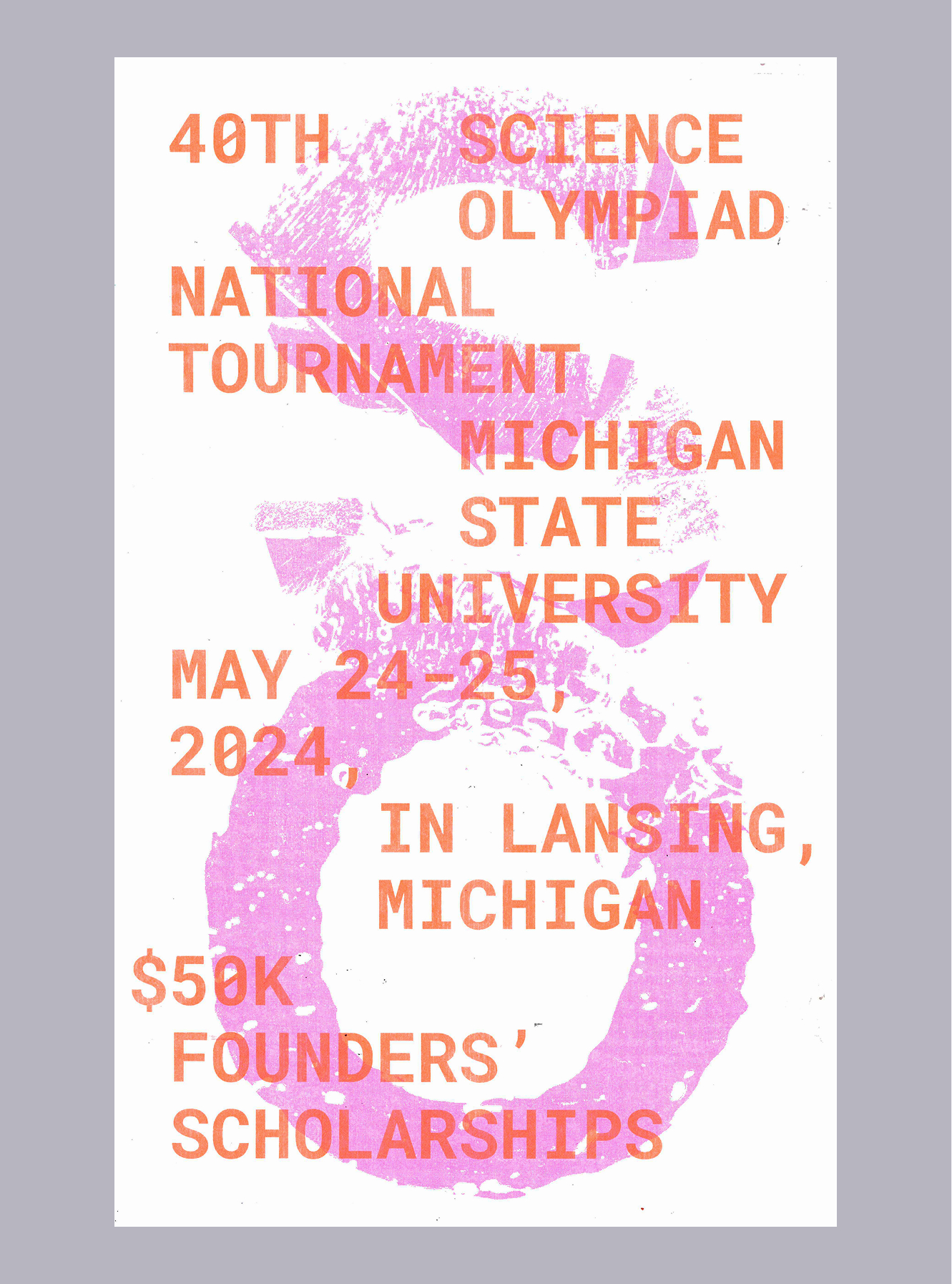
40th Science Olympiad at Michigan State University, event posterThe Science Olympiad is one of the largest STEM competitions in the USA, uniting students, teachers, and volunteers across the 50 states in their passion for science. In anticipation of their 40th annual event at Michigan State University, I designed an experimental concept poster.

For this project, the idea was to create visually interesting letterforms by combining analog and digital design processes, an idea I was exploring concurrently in my thesis project. This method of designing and its unique results reflected the observational and experimental nature of science itself.

The “S and O” were created through experimentation with different cause-and-effect reactions on liquid substrates, leading to some organic forms. In the end, this project was showcased at Swash & Serif, Toronto’s only annual typographic and lettering exhibition.
April 202428 x 43 cmExhibited as part of Swash & Serif 8
01/03
40th Science Olympiad at Michigan State University, <span class='lowercase not-italic'>event poster</span>
01/08